The Vanzant Brush Twitter Feed

Let's Go Shopping!

https://www.redbubble.com/people/mvanzant/shop?asc=u&ref=account-nav-dropdown
Showing posts with label oil paintings. Show all posts

Sunday, August 12, 2018

A Word About Color Temperature

One of the most important rules of color temperature is that warm colors protrude (pop forward) and cool colors recede (fade back). So, if you think about the color scale, this would mean that red, yellow and orange would surge forward in a painting as opposed to the cool colors of blue, purple and green which would make things look like they are further away. That is why cool colors are used to signify elements in a distance like trees and houses because it denotes atmosphere between the foreground and the background of a painting.

We won’t go into a lot of detail about value (light and dark) but I will mention that the value scale is also used to show how close or further away something is and that there is a value scale within these temperature groups that will also intensify atmosphere. The closer something is to us the darker and clearer it should look and the further away it is the lighter and more diffused it should be, again signifying more atmosphere. Nothing explains concepts better than examples so let’s look at a painting by Henri Lebasque titled Blue Mountains in Cannes.

Henri Lebasque
Starting at the top of the painting, we see the mountains are painted with cool blues & purples (very gray, meaning lack of color intensity), showing atmosphere and visually telling the viewer that the mountains are far away.

Now, here is something interesting. Balconies are usually high, higher than the landscape below them and in this painting the perspective tells us that the balcony is indeed very high in the air. Which would mean that the possibility of having trees right next to the balcony is not impossible but is improbable. So, let’s focus on the balcony. Look at the first opening to the left. The cool purple makes it look like whatever you are catching a glimpse of is far away but look at the other openings to the right of the figure. The dark green is too dark and not cool enough. Do you see how that green looks like its bursting through the balcony openings? Now, I am not saying that the great Mr. Henri Lebasque did not see that intense green on that bright beautiful day in Cannes, but I AM saying that this is a great example of how temperature is important to denote atmosphere in a painting.

So remember, cool colors recede, warm colors push forward so the next time you look at a painting notice how the artist has used temperature to portray atmosphere and mood. 


Think Creatively!

Friday, June 5, 2015

Next Exhibit - Philadelphia Sketch Club

Please join me at the 2015 PSC Benefit Juried Art Show to benefit the The Philadelphia Urban Creators. My paintings "Camden Overpass in Winter" and "Hudson River Valley Pasture" will be on exhibit. Hope to see you there!

Reception Info   
Sunday June 21, 2015, 2:00 – 4:00 PM 
The Philadelphia Sketch Club:
235 S. Camac Street
Philadelphia, PA 19107-5608 
215-545-9298 


Camden Overpass In Winter - Oil on Board


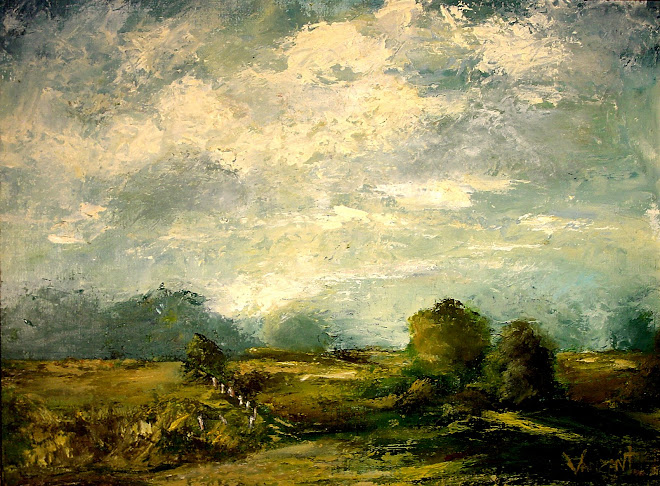
Hudson River Valley Pasture - Oil on Board

Monday, April 18, 2011

Time For New Ideas!

It's been a long time. I have been a tad busy but everything is going great. I have been accepted as a finalist for The Icon Prize . A chance to participate in this project, the republished book cover for the wonderful novel "The Unfastened Heart", is very exciting and I am truly honored. I know, I know - it sounds lame but it's true!

Also, I have just returned from a workshop at the Watts Atelier studying with Jeffrey Watts . What an experience! I will write about this in a blog by itself soon.

I feel the need to stretch my artistic wings! I have some new ideas for the next stage of my artistic journey. It involves abstracts...

Every time you knowingly hurt someone you lose a piece of yourself. I believe we are a culmination of not only our environments but also our actions. In the end, how much of us is left? The working title of my new series is titled “Fractured”. I am not sure when I will have the first painting completed or even started. I am sketching out my ideas now. I hope for productive thoughts, exciting ideas and I wish the same for you.

Best Regards, Monica

Friday, October 22, 2010

Why I Love To Paint Landscapes

The other day I was working on a new piece and I wondered why I loved painting landscapes so much. I think it is because nature is ever changing, regenerating itself despite season, desolation or man's interference. The elements of nature will be here long after man has disappeared. A volcano erupts, lava flows and what do you get? More land. Something that can be so destructive actually creates more than it takes. A fire burns, leaving the acrid smell of smoke and ashes and what does that leave? Regrowth. Buds burst from the burnt cinders and generates the wonderful gift of nature for us to enjoy once again.

The ability to destroy yet also renew, to be both as beautiful as the first bloom of a spring flower or as glorious as the most ominous storm cloud is why I love landscapes. It is never the same. I see something new in every leaf and every petal. My senses glory over the smell of newly cut grass, the scent of an impending rainstorm, the wonderful quiet of a hidden field of wildflowers that only I have managed to discover; at least in my own mind.

When I paint landscapes, in some small way, I try to show the viewer that though the nature of a season may remain the same, none are ever identical.

Monica

Monday, June 28, 2010

2010 Renoir Exhibit In Philadelphia

I visited the Renoir exhibit on Sunday at the Philadelphia Museum of Art. I could not get enough of his beautiful, soft and wistful canvases. Captivating people painted with whimsical expressions having fun and looking delightfully cheerful. Pretty girls in frilly dresses that now would be called costumes. A style so distinct you recognize it immediately as a Renoir. This is a man who, like many of his peers, dedicated his entire life to his craft. In his later years even after developing arthritis he still painted for another 20 years. I strive to learn from this artist. Not necessarily his style but definitely his passion for painting, which never faltered.
 
My favorite Renoir quote -

“I think I’m beginning to know something about painting,” said on the day he died.

To learn more about Pierre-Auguste Renoir visit here or here.

Best Regards, Monica

Wednesday, May 19, 2010

Blick Sponsored Art Challenge!


Announcing an oil painting challenge currently in progress in the Oil Painting group (OPG) on a site I am a member of called Red Bubble (RB). If you don't know about it, it is a social networking art and photography website and is a wonderful forum for communicating with other artists and also exhibiting and selling your art. Unfortunately, the contest is for RB members only, but now that you know about it - check it out! You may want to become a member and enter the next contest. Please visit the Oil Painting Group Challenge Page to follow the challenge titled "Artists Choice". This challenge is sponsored by Blick Art Materials . If you haven't visited their website you're in for a treat! They are currently celebrating their 100 yr anniversary so please visit their website http://www.dickblick.com/ to discover all this company has to offer.


Best Regards, Monica

Sunday, May 16, 2010

Results of the Red Bubble Challenges Sponsored by Kama Pigments


And we have our winners! The talented artists who won the Kama Pigments sponsored challenges on RedBubble are:

Graham Clark won the Landscape challenge with his painting "Brimham Rocks".


Elena Oleniuc won the Still Life challenge with her painting "Happy Morning" .

and Elena also won the Human Figure challenge with her painting "Dance" .

To learn more about Graham...Graham Clark or
here.
To learn more about Elena...Elena Oleniuc .

Red Bubble hosts thousands of talanted painters, photographers and writers. Please pay a visit to the wonderful art networking site.

Thanks again to Kama Pigments our sponsor for these challenges and visit their website to discover all this company has to offer.

This was a wonderful challenge but I have one question. Are you ready for next year?

Best Regards, Monica

Saturday, February 13, 2010

Samaritan Hospice Exhibit 2009

I am posting a couple of photos from my latest exhibit "Arts for Awareness". It was an important fund-raising event for a wonderful cause, The Samaritan Hospice. Check out http://www.yogacenterofmedford.com/ if you get a chance. It is a beautiful venue.

I wish all of my fellow artists creative and productive year!

Best Regards, Monica Vanzant

Lily - "The Icon Prize" Finalist

A huge thank you to Lane Von Herzen, author of "The Unfastened Heart" and the Icon Prize committee for allowing me to be a part of this wonderful project.


Creation of still life "The Two No One Wanted"